
Full sublimation jerseys give teams complete freedom to design every part of the jersey, from colours and patterns to names, numbers, and sponsor logos. Unlike standard jerseys, the entire design is printed directly into the fabric, allowing for more complex and visually striking designs.
However, this level of flexibility also means that without proper planning, a sublimation jersey can easily look overcrowded, unbalanced, or difficult to read during games. Simply adding multiple elements together does not guarantee a professional-looking result.
Here are 5 key pointers you should consider when designing your own sublimation jersey to ensure it looks clean, functional, and professional. Teams looking for custom sublimation jerseys Singapore can benefit from understanding these fundamentals before starting their design.
Choosing the Right Colour Combination for Sublimation Jerseys
Choosing the right colour combination is one of the most important aspects of designing a sublimation jersey, as it defines the overall visual impact of the design. A well-structured colour palette helps create a jersey that looks cohesive and professional, while poor colour choices can result in a design that appears cluttered or visually unbalanced.
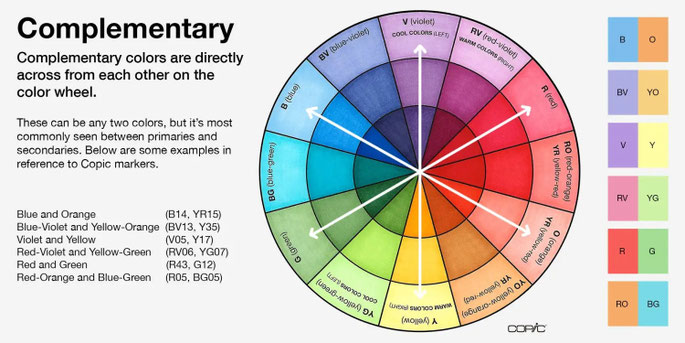
When selecting colours, teams should consider both colour harmony and contrast. One useful reference is the colour wheel, which helps identify combinations that naturally work well together. Depending on the design direction, teams can use complementary colours for strong contrast, analogous colours for a cleaner look, or triadic colour combinations for a more vibrant and dynamic design.
At the same time, sufficient contrast between the base colour and elements such as names and numbers is essential to maintain visibility during gameplay. In most cases, it is advisable to limit the design to two or three main colours to maintain clarity and consistency, especially for sublimation jerseys where full-coverage designs can easily become overwhelming.
Finally, the chosen colour palette should align with the team’s identity, whether it is based on school colours, corporate branding, or club representation. A consistent and well-planned colour scheme helps create a strong and recognisable presence on the field.
How to Choose Fonts, Names and Numbers for Sublimation Jerseys
Names and numbers are a key functional element of any sublimation jersey, and their readability should always be prioritised. No matter how good the overall design looks, if the names and numbers are difficult to read from a distance, the jersey will fail in actual gameplay conditions.
When selecting fonts, teams should avoid overly stylised or decorative typefaces that may look visually appealing but reduce clarity. Instead, it is recommended to use clean, well-defined fonts that are commonly seen in sports jerseys, as these are designed for visibility and consistency. Proper sizing, spacing, and alignment of both names and numbers are equally important to ensure a neat and professional appearance across the entire team.
Contrast also plays a critical role. The colour of the names and numbers should stand out clearly against the base jersey colour. In some cases, outlines or strokes can be used to further enhance visibility, especially when dealing with complex background patterns in sublimation designs.
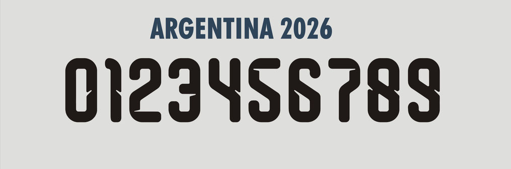
In recent years, many teams have also started adopting modern tournament-style fonts inspired by international competitions. At Zurlique, we offer the latest World Cup 2026-inspired fonts, allowing teams to achieve a more current and professional look that reflects global football trends. This is especially important for teams ordering sublimation football jerseys Singapore, where clear and readable numbers are essential during matches.
Best Logo Placement for Sublimation Jerseys (Club and Sponsor Logos)
Logo placement plays a key role in how professional and well-organised a sublimation jersey looks. Even with a strong overall design, poorly placed logos can make the jersey appear unbalanced or cluttered.
Most jerseys follow a standard structure. The club crest is typically placed on the left chest area, while the main sponsor logo is positioned prominently at the centre of the jersey. Additional sponsor logos may be placed on the sleeves or upper back, depending on the design and requirements.
It is important to maintain a clear hierarchy of logos. The primary sponsor should be the most visible element, followed by secondary sponsors in less dominant positions. When too many logos are given equal prominence, the jersey can lose visual focus and look overcrowded.
Proper sizing and alignment are also critical. Logos should be proportionate to the jersey and aligned consistently with other elements such as names and numbers. Placing logos too low, too large, or too close to other design elements can disrupt the overall balance of the jersey.
Finally, teams should ensure that logos do not interfere with key elements such as player numbers or names. A well-planned layout allows all elements to coexist clearly, resulting in a jersey that looks both professional and functional.
Sublimation Jersey Design Styles and Patterns for Teams

One of the key advantages of sublimation jerseys is the ability to create full-coverage designs with complex patterns and visual effects. However, achieving a professional result requires more than just selecting a pattern — it involves understanding how different design elements work together across the entire jersey.
A well-designed jersey typically follows a clear pattern structure, where elements such as gradients, lines, and geometric shapes guide the visual flow of the design. These elements should work together to create a cohesive look rather than competing for attention. Establishing a clear focal point, usually around the centre chest area, helps anchor the design while supporting elements enhance the overall appearance without overwhelming it.
Another important consideration is panel mapping. Jerseys are constructed from multiple fabric panels, including the front, back, and sleeves. Designs must be planned with these panels in mind to ensure that patterns align correctly after stitching. Poor alignment across seams can disrupt the visual continuity and make the jersey look unrefined.
Designers should also pay attention to pattern density. Overly complex or crowded designs can make the jersey look messy, especially when combined with names, numbers, and logos. Incorporating areas of negative space helps balance the overall composition and improves readability.
While sublimation allows for seamless gradients and intricate designs, it also requires careful planning to ensure that all elements remain visually balanced and consistent across the final garment. A controlled and well-structured design will always look more professional than one that tries to include too many competing elements. This level of design flexibility is particularly useful for teams creating sublimation basketball jerseys Singapore, where bold and dynamic patterns are commonly used.
Using Heat Transfer and Embroidery on Sublimation Jerseys
Sublimation serves as the foundation of the jersey, where the main design, colours, and patterns are fully printed into the fabric. This allows for long-lasting designs that do not peel or crack over time. However, in some cases, teams may choose to combine sublimation with other printing methods to achieve specific effects.
Heat transfer is commonly used for certain elements such as sponsor logos or additional details that require sharp, solid colours. It can be useful when the design involves simple graphics that need to stand out clearly against the jersey background. Embroidery, on the other hand, is often used for club crests to create a more premium and textured finish, giving the jersey a more traditional and professional look.
From a cost perspective, adding heat transfer or embroidery will typically increase the overall price of the jersey. Embroidery in particular tends to be more expensive due to the stitching process and time required. Teams should consider whether these enhancements are necessary based on their budget and the intended use of the jerseys.
These methods should also be used selectively. Large embroidered areas can make the jersey heavier and less comfortable, while relying too much on heat transfer may reduce the overall benefits of sublimation. A well-balanced combination ensures that the jersey maintains both performance and visual quality.
Conclusion
Designing a sublimation jersey is not just about creativity, but about making the right decisions across colours, fonts, logo placement, and overall design structure. When these elements are properly planned, the final jersey will not only look professional but also perform well in actual use.
By understanding these key considerations, teams can avoid common design mistakes and create jerseys that are both visually strong and functional on the field.
If you are planning to create your own sublimation jerseys, working with an experienced supplier can make a significant difference in achieving the right result. Feel free to reach out to Zurlique for guidance on design, fonts, and printing options to ensure your jerseys are done properly from start to finish. You can contact us at 9774 8888 (WhatsApp available) for a quick discussion.
Write a comment